
If your library’s website doesn’t have a search field at all, this post isn’t for you. Your site has way bigger issues to contend with. (But, feel free to use this post to guide the creation of a search function. Go get one…NOW.)
However, if your website does have a search, chances are that you still don’t get off the hook. I’ve been looking at a lot of library websites recently, here in Ohio, and there are definitely some common issues with search. Some of those problems even apply to sites I’ve built.
Where I work, we’re currently working on implementing more usable searches for our clients’ websites. All of the changes are based on best practices and usability data. I thought I’d share our changes, so you could use them as a guide for cleaning up your own problems.
Here’s our old-style search:

And here’s our newer version:
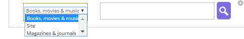
- We’re getting rid of placeholder text. We thought it would be helpful to have a clue as to what to put in the search field. Turns out, that’s actually a really bad idea. It actually causes more confusion for users, especially those with some types of disabilities. Buh-bye, placeholder text.
- We’re getting rid of the jargon. We’ve long encouraged our clients to avoid terms like “links” and “resources” in their sites’ navigation. However, we didn’t apply this logic to search options. We provide a federated search for statewide research databases, called the Ohio Web Library. And, that’s what we called the option to search it: “Ohio Web Library.” Nobody really knew what that was. We did provide a small link nearby, labeled “What is this?” Expecting people to click this was probably nuts. We’re changing the label to “Magazines & Journals.” (Read more about library jargon in this Library Journal article.)
- We’re placing it right. On sites where the search box is not already in the top right of the header, we’re (slowly) getting them moved. That location is pretty much already a standard web convention, and we don’t want to make people search for search.
Those are the changes we’re making; however, in my scoping out of many other library websites, I found a couple of other common problems that we didn’t have. These included:
- Only searching the catalog. Yes, the catalog gets searched the most. But don’t hobble your users; give them an option to also search the regular website as well.
- Multiple search boxes. Talk about cognitive load. When there is more than one search box (such as one for the catalog and one for the site), users have to spend time thinking about which they want. And making users think is bad. Having two search boxes has long been viewed as poor practice. Easier to implement than just one, yes. But this isn’t about you; it’s about the user.
What do you think? Will you make any changes to your library’s website search?


